Conversational or single-page? Start with the task.
A one-question-at-a-time form can help someone focus. A single page can help them scan and finish a familiar request. Neither format wins every time. Here is how to choose between conversational, single-page and document-style forms without relying on a promised conversion lift.
Three layouts, three useful starting points
| Layout | Try it for | Watch for |
|---|---|---|
| Conversational | Guided surveys, quizzes and branching enquiries | Extra navigation when the task is short or familiar. |
| Single-page | Short signups, repeat requests and quick reviews | Too many fields competing for attention at once. |
| Document-style | Briefs and applications that need explanation | Long paragraphs that bury the questions. |
Conversational: focus on one decision
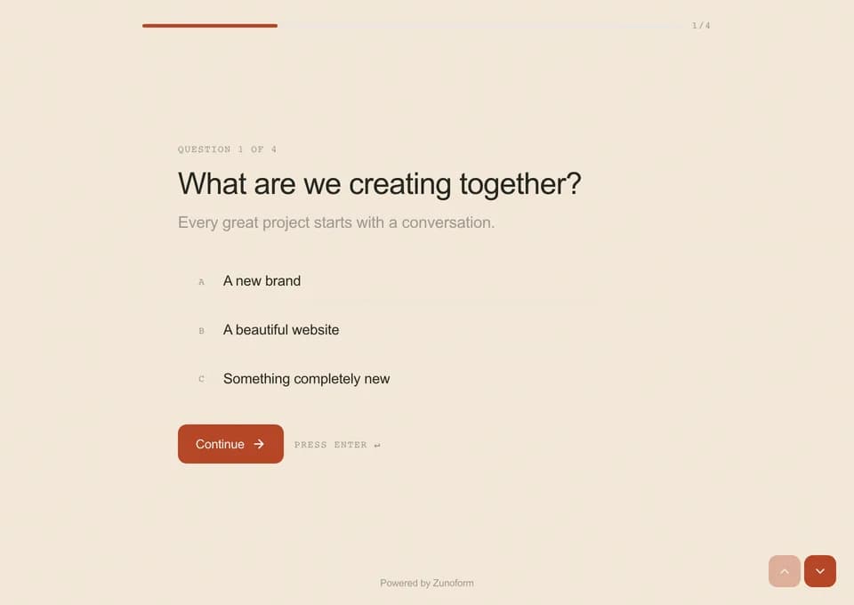
A conversational layout presents a question, its instructions and an input before moving to the next step. It can be useful when a follow-up depends on an earlier answer or when each question needs some thought. Keep the progression clear and give people a way to correct earlier answers.
The trade-off is navigation. Asking someone to move through separate screens for a two-field signup adds interaction without adding information. A returning employee entering a familiar request may prefer to see everything at once.
Single-page: scan the work before doing it
A single-page form shows the fields together. Respondents can see the information requested and move directly to a field they want to edit. It is a useful starting point for a contact form, a short signup or a repeated internal task.
The risk is a page that becomes an unstructured list. Remove low-value questions, group related information and avoid turning every optional follow-up into a permanently visible field. One page should not mean one uninterrupted wall of inputs.
Document-style: give the questions some context
A document layout mixes text and questions in a reading order. An application can explain the selection process before asking for supporting information. A client brief can introduce a project section before asking about goals and constraints.
Use the extra space to clarify the task. Do not fill it with a company introduction the respondent has already read elsewhere. Put instructions close to the relevant input so the reader does not have to search for them.
What research does—and does not—tell us
A 2021 JMIR Human Factors usability study compared three digital forms for a hospital referral task with 20 participants. The single-page version performed best across most of the reported usability measures. The conversational version in that study was a chatbot, and the task was a specific health care workflow; it was not a test of Zunoform or a general marketing conversion benchmark.
That is a reason to question universal claims about layouts, not a reason to declare a universal winner. W3C’s accessibility guidance also recommends breaking long forms into logical stages where appropriate and making progress and optional stages understandable.
Source: JMIR Human Factors: Comparing Single-Page, Multipage, and Conversational Digital Forms
Source: W3C WAI: Multi-page Forms
Run a layout test that answers your question
- Keep wording, required fields and the offer as similar as possible between versions.
- Use comparable traffic sources and account for phone versus desktop usage.
- Track starts and completed responses separately; a page view is not a started form.
- Look at answer quality, errors and the time people need, not only completion.
- Ask a few target respondents to explain where they hesitated.
- If you cannot split traffic fairly, treat a before-and-after result as directional rather than proof.
Apply the choice in Zunoform
Zunoform offers Conversational, Document and Single-page when you create a form. All three layouts are available on Free. AI generation is a separate Business feature; payments, signatures and NPS require a paid plan to publish.
Preview the whole experience, including helper text and the ending page. A clear close matters in any layout: explain what was received and what happens next. You can use a closing message alone or configure a button, link and other ending options.
The product does not provide a built-in randomized A/B test. If you compare separate forms, arrange the traffic split externally and interpret the results in light of how each visitor arrived.
Questions people ask
Do conversational forms always convert better?
No. Results depend on the audience, traffic source, questions and task. Test the actual flow rather than applying a percentage from a different product or use case.
Which layout should I use for a short contact form?
A single-page form is a useful starting point because the requested information is visible together. Use a guided flow when the questions or branches justify it.
Where does document layout fit?
Use it when people need to read explanations as they answer, such as a project brief or application. It is a web form with text blocks and fields, not a PDF editor.
Are all three layouts included in Zunoform Free?
Yes. Free includes all three layouts and up to 500 responses per month. Paid feature requirements still apply to payment, signature and NPS fields, AI generation and custom domains.
Keep reading
Better forms.
Better data.
Start with a conversation, a document or a single page. Unlimited forms and 500 responses per month on Free. No card required.